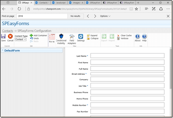
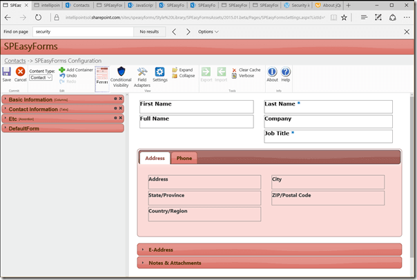
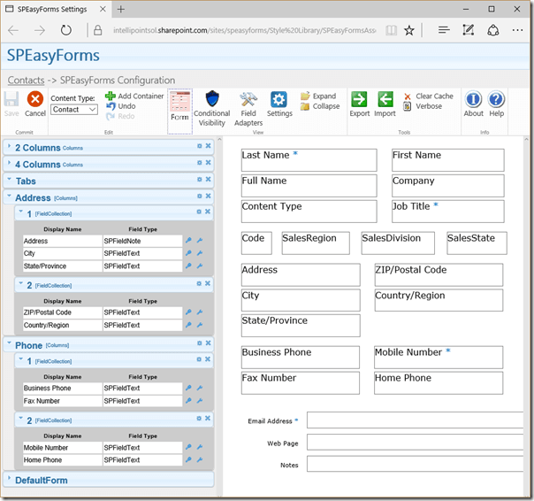
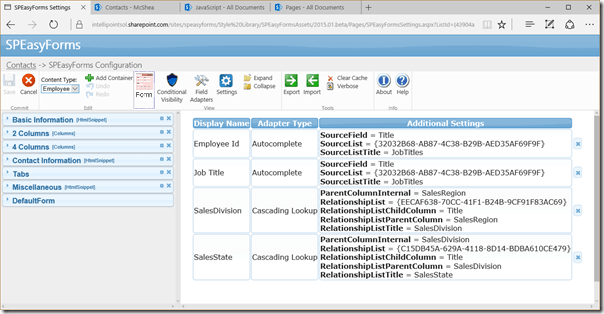
SPEasyForms is a GUI tool for applying jQuery constructs to Out of Box (OOB) SharePoint forms without necessarily knowing anything about JavaScript or HTML or CSS. You configure SPEasyForms through a drag and drop IDE-like list settings page, which is available on the list ribbon or as a link on the list settings page of compatible SharePoint list types (currently all lists except Surveys and Discussion Boards) and libraries. The things you can configure fall into 3 broad categories:
- Containers - the ability to organize fields in a form in some way; current implementations include:
- Tabs - an implementation of jQueryUI tabs
- Accordion - an implementation of jQueryUI Accordion
- Columns - the ability to put fields or containers into 2 or more columns instead of one per row (technically, one or more, but one column doesn't really buy you much)
- Stack (NEW!) - allows you to stack 2 or more containers on top of each other, so you can put multiple containers onto a single tab or accordion page.
- Wizard (NEW!) - a specialty container that allows users to page through containers using next and previous buttons.
- HTML Snippet (NEW!) - a specialty container, that doesn't actually hold any fields, but allows you to inject arbitrary HTML into the page, including referencing external scripts and style sheets.
- Conditional Visibility - conditionally format a field:
- Based on various conditions like:
- Membership in a SharePoint group
- Which form is open (i.e. the new, edit or display form)
- Comparing the values of other fields based on various comparison operators (i.e. make this field read only when the Color field is equal to Red), comparison operators include:
- Equals - equals a string literal
- Matches - matches a JavaScript regular expression
- NotMatches - does not match a JavaScript regular expression
- GreaterThan (NEW!) - greater than a string literal
- GreaterThanOrEquals (NEW!) - greater than or equals to a string literal
- LessThan (NEW!) - less than a string literal
- LessThanOrEquals (NEW!) - less than or equals a string literal
- NotEquals (NEW!)- is not equal to a string literal
- Based on various conditions like:
- Formatting Options:
- Hiding a field completely
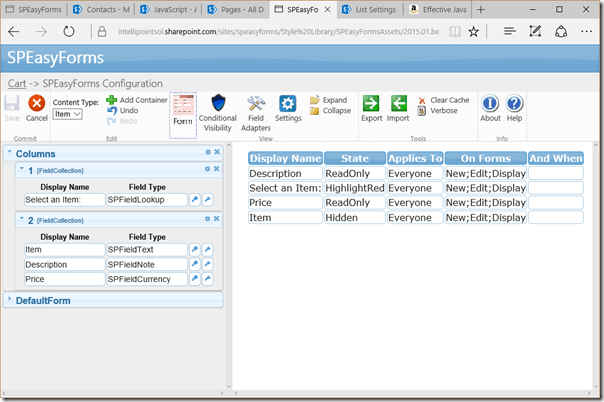
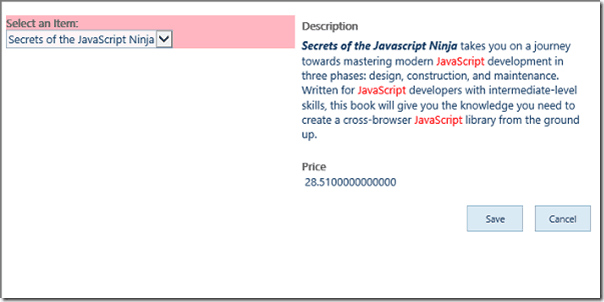
- Making a field read-only
- Highlighting a field in one of four colors (NEW!)
- Field Control Adapters - modify the controls users see in the form to input data; current implementations include:
- Cascading Look Ups - join two look up fields such that the values available in one look up are trimmed based on the value selected in another look up
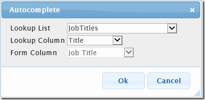
- Autocomplete - provide type ahead functionality in a text field based on values pulled from a field in another list on the same site
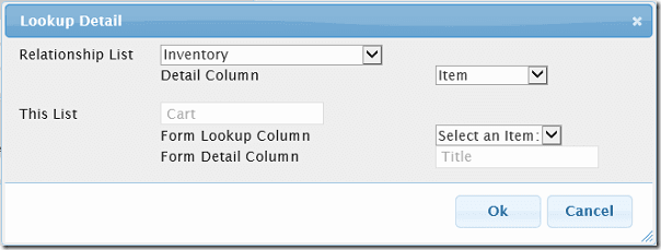
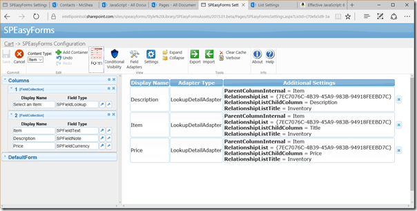
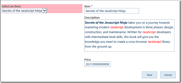
- Lookup Detail (NEW!) - allows you to pull in additional fields from a lookup list based on the value selected in a lookup field.
- Default to Current User (NEW!) - pre-populate a user field with the current user on the new form.
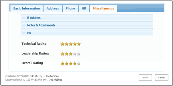
- Star Rating Adapter (NEW!) - can be applied to numeric fields. Fields are displayed as five stars and edited by clicking on one of the stars.
Most of the things marked (NEW!) were actually released in the updates package to v2014.01. The Stack and Star Ratings Adapter are actually brand new. Other than that, most of what's changed in v2015.01.01 is:
- Added a Client Side Rendering (CSR) hook to hide the form until SPEasyForms has done it's work, making the page load less jumpy (SharePoint 2013/Online only).
- Configure the jQuery UI theme used at the list and/or site collection level.
- Nested containers. Drag and drop parts of containers to reorder tabs for instance or move a tab to an accordion page.
- No longer using the default master, the settings page is now a stand-alone AXPX. This allows the same interface in SharePoint 2010 as 2013/Online. Also, highly customized master pages no longer mess-up the UI.
- Significant performance improvements on the settings page, especially for intense redraw activities like drag and drop.
- Updated third party libraries to their latest stable release: jQuery, jQuery-UI, and SPServices. In the case of jQuery and jQuery-UI, that's the latest 1.x release.
The rest of this user manual will consist of an Overview section (system requirements, installation, and a laundry list of UI buttons and views), and sections for Themes, Containers, Conditional Visibility, and Field Control Adapters. In those last 3 sections, we'll follow a scenario (i.e. state some basic requirements and how those requirements can be satisfied using SPEasyForms). This scenario will be a Contacts list with multiple content types (Contact and Employee).
1. Overview
People learn differently. This section is primarily reference information. Some people want to scan this first to get an idea of what's available for the 10,000 foot view. Others want to jump right into using the thing and go back to the reference material on an as needed basis. I've chosen to put this up front in my document, but if you fall into the latter group and you already know how to install a sandbox solution, you can certainly skip this section and jump to section 2. Themes. If you just need help installing it but then want to jump in, read the next two brief sections and then skip to section 2. Themes.
1.1 System Requirements
SPEasyForms was developed to run on Office 365 and SharePoint 2010 and 2013. It has been pretty well tested on all three platforms, meaning all of the functionality has been tested on all three platforms, but not necessarily on every list and library type available on all three platforms. Testing was done with Internet Explorer 9, 10, and 11, as well as Microsoft Edge, Firefox 24, 28, and 32 and Chrome 35. That does not mean those are the only browsers we plan to support, but there is a limit to how many browsers a small team can reasonably test. If you find an issue with a particular browser, report it in the issues list on CodePlex and we will address it as quickly as possible. There are no plans to support SharePoint 2007.
1.2 Installation
In order to install SPEasyForms, you must be an SCA. SPEasyForms installs all of its scripts and resources in the Style library. By default all users in the site collection can see files in the Style Library. If you muck with the permissions in this library, users who cannot read these files will not see any of the changes you configure with SPEasyForms. Also, mostly on SharePoint 2010, the Style Library defaults to force checkout of files before editing, and all of the files will automatically get checked out during installation. Nobody else will see these files until they are checked in, and there are hundreds of files so you don't want to have to check in these files manually. To get around this, you should turn off force checkout on the Style Library before installation.
To get started, download the latest recommended release from https://speasyforms.codeplex.com and follow these steps to install it:
- Go to the root site of your site collection and go to Site Settings -> Web Designer Galleries -> Solutions.
- Click the Upload Solution button in the ribbon.
- Browse to the SPEasyForms.wsp file you downloaded from CodePlex and hit OK.
- When the upload finishes, click the Activate button from the ribbon. Note that activation will take quite a bit of time because of all the files being copied to the style library and there is no indication that anything is happening, so be patient.
Now that wasn't too painful, was it? To confirm that it appears to be working, go to a list in your site collection and look for a button in the Settings panel of the List, Library or Calendar ribbon labeled SPEasyForms:
Click on the the icon and you should see the SPEasyForms Settings page, pictured in the next section.
If you've gotten this far, and the settings page looks OK, the thing is installed. If you've already encountered a problem, go to CodePlex and open a new thread in the discussion board with your issue. I generally try to respond pretty quickly, and as I build up a list of frequently encountered issues I'll update this document with a troubleshooting section.
1.3 The List Settings Page
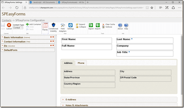
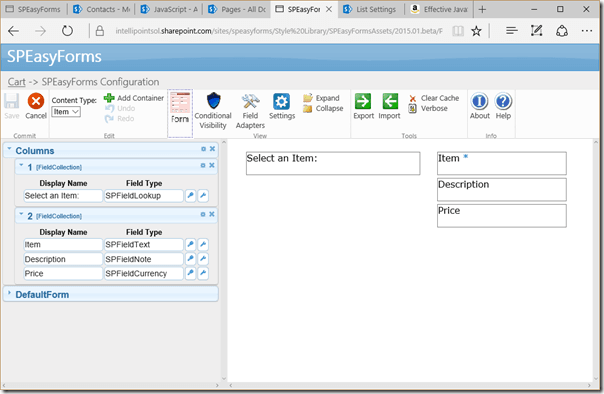
The list settings page is pictured above. It is comprised of four parts:
- Bread Crumbs - starts with the name of the list, which is a link back to the page that brought you here, followed by the page title, and optionally followed by the current view. Note: the bread crumbs are currently missing in SharePoint 2010. At some point I will figure out where to put them and how to get them there and I'll put them there.
- The Ribbon - most of the high level functionality is controlled by buttons organized on the ribbon. Each button will be described in the next section.
- Properties Pane - on the left-hand side of the main content area, this is where you configure individual fields in the form.
- WYSIWYG Pane or Editor - when the page first comes up, this shows a WYSIWYG (what you see is what you get...well, mostly anyway) representation on the right-hand side of the main content area. This provides a visual representation of the form as currently configured. You can change the view to display a list of field visibility rules or field adapters using buttons on the ribbon.
1.4 Ribbon Buttons
This section is just a laundry list of the ribbon buttons intended primarily for reference. Most of the functionality of SPEasyForms is exposed through the following ribbon buttons:
1.5 The Properties Pane
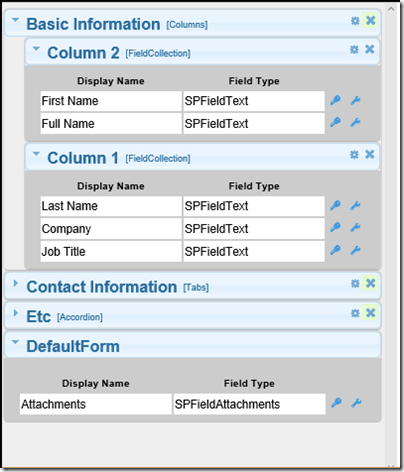
The left-hand side of the main content area is the properties pane. Most of the configuration of SPEasyForms is done from the properties pane. It contains a gray box per container, with the name and container type as the title. You can collapse all containers (i.e. show only the title) using the buttons on the ribbon. You can also collapse/expand individual containers by clicking on the triangle icon in the upper left-hand corner, or collapse/expand a container and all of it's children by double clicking on the container.
A container contains one or more sub-containers, used by the container in a container specific manner. In other words, the tabs container draws one tab per immediate sub-container, and puts each sub-container on the appropriate tab. The sub-container name or title is also used as the tab name in the form. The columns container creates a table with X columns where X is the number of sub-containers, and puts each sub-container in the appropriate column. The sub-container title is not displayed at all in the form for a columns container, it is only displayed on the settings page.
Ultimately, at the leaf nodes, a container usually has a special sub-container called a field collection, which is just a logical grouping of fields. You can drag and drop fields within or between field collections. When the editor first opens for a list that has not been configured before, all of the fields appear on a special container call the DefaultForm container. This represents to out of the box SharePoint form.
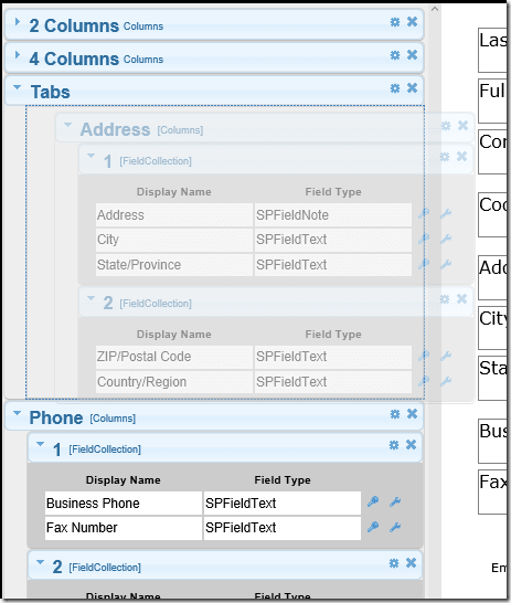
You can also drag and drop containers to reorder the tabs on a tabs container for instance, or to make one container a sub-container of another container. There are some restrictions however. The default form, html snippet container, and field collections cannot have sub-containers. The default form also cannot be a sub-container; you can move it up and down at the top level but you cannot put it on another container. Finally, a field collection cannot stand alone (i.e cannot be a top-level container), it must be a sub-container. If you try to drag something to a place where it cannot be dropped, the placeholder turns red. If you drop it anyway, it returns to its original position.
Getting comfortable with the different ways to collapse things in the properties pane is important because you move fields between containers and collections, reorder fields within a collection, and reorganize containers by dragging and dropping them. When you have a lot of fields, and containers, and field collections, and you want to move something from the bottom of the form to the top, it is a lot easier if you collapse stuff that is between the containers with which you are currently working.
The containers also have icons that perform specific actions depending on their context/scope (i.e. the icons are generally to the right of what they configure or on the title of what they configure, and can be for configuring the container itself, or an individual field). These buttons are described in the following table:
| Button | Scope | Description |
| Container | Configure the container. You can change the container name/title and/or add field collections to the container. | |
| Container | Delete this container, all fields that were on the container (or a sub-container) are returned to the default form. There is no confirmation, but you can always undo. | |
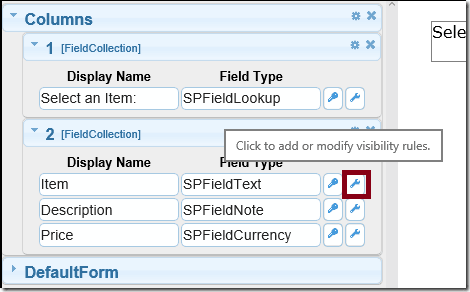
| Field | Configure field visibility rules for this field. | |
| Field | Add or configure the field adapter for this field. If there are no field adapter types available for a particular field type, this button will be missing next to fields of that type. |
1.6 Security In SPEasyForms
The ribbon button for configuring SPEasyForms for a list is security trimmed and you need to have the Manage Lists permission in order to see it. But that's not really security, it's security trimming.
So the next question is, what are the security considerations you should be aware of when using SPEasyForms? SPEasyForms security is entirely based on file system security, meaning that what a user can do with SPEasyForms is based on the SharePoint permissions assigned to the files that SPEasyForms depends on.
These files fall into two broad categories:
- The scripts, styles, and images used by SPEasyForms are all installed into the SPEasyFormsAssets folder of the Style Library in the site collection root. If the current user cannot read these files, then none of the things you configure SPEasyForms to do will be done on any forms opened by the current user. Note also that these files must be checked in. This is an important consideration, because in SharePoint 2010 at least the Style Library defaults to force checkout, which means all of the files are checked out when you first install SPEasyForms, and no non-privileged user will be able to see them. To get around this, turn off force checkout on the Style Library before activating SPEasyForms. If you forget, deactivate SPEasyForms, turn off force checkout on the Style Library, delete the SPEasyFormsAssets folder in the Style Library, and activate SPEasyForms again. You can now turn force checkout back on for the Style Library if you like. The alternative is you could manually check-in the 300+ files SPEasyForms lays down in the Style Library'ugh. This is generally only a problem for SharePoint 2010.
- The configuration files for a given list are text files saved in the root of the Site Assets library on the same site as the list that was configured. If a user is not able to read these files, then none of the things you configure SPEasyForms to do will be done on any forms opened by that user. Also, if a user cannot write to these files, they will not be able to successfully save any changes on the settings page. Note also that if a user can write to these files, they can alter the configuration of lists regardless of whether or not they see any links to the settings page, so there is a bit of a disconnect between the security trimming and the actual security. Some users may see the links but not be able to save configuration changes; other users might not see the links but might still be able to save configuration changes.
Just keep in mind that the actual security is based on the permissions of the files and you can lock down SPEasyForms however you like. You can even give a non-privileged user the ability to modify the SPEasyForms configuration for a given list just by breaking role inheritance on the configuration file for that list, explicitly giving them write access to it, and sending them a link to the settings page for that list (since they might not see the security trimmed links to the settings page).
So after installing SPEasyForms the first thing you should do is lock down these files by:
- Break role inheritance on the Style Library/SPEasyFormsAssets folder and assign permissions so everyone can read the files but only privileged users can write to the folder. By default, members can edit these files which is probably not what you want.
- Break role inheritance on the Site Assets library of each site where you use SPEasyForms and assign permissions such that only users you want to be able to configure SPEasyForms can write to it, but all site users can read from it. Again, by default members can write to this library which is probably not what you want.
1.7 Limitations
SPEasyForms is intended to work on the OOB new, edit, and display forms for most list types. It does not work on Discussions or Surveys, and there are other list types where exhaustive testing has not been done. It also does not allow you to configure content types based on folder. Folders rarely have enough metadata to require such a solution, but the bigger issue is that Microsoft subclasses folders for some pretty strange content types (like document set or OneNote document) that are so different from other OOB list types. It would nearly double the code to deal with them.
The reason for these limitations is fairly obvious, in that SPEasyForms modifies the OOB forms by directly manipulating the Document Object Model (DOM) and/or applying CSS to DOM elements. That means it needs to make some assumptions about the structure of a document. But SharePoint, and particularly SharePoint designer, allow you to customize the DOM to your hearts content. And in the case of lists like Surveys, Microsoft has modified the DOM themselves enough that the OOB form does not look much like the DOM for a generic list. For instance, SharePoint normally produces forms that consist of a table with a row for each field. But you can modify the XSLT for a DataFormWebPart such that the fields are displayed as floating divs with fixed positions and there is no table whatsoever. And there's technically nothing wrong with that, but you will certainly have made the form unusable by SPEasyForms because you've broken the parser. The rest of this section will attempt to describe the DOM elements and structure on which SPEasyForms depends. If you are not going to muck with the structure of the form at all, you don't really need to worry about these details.
So the basic constraints are as follows:
- The form should be in a table with the CSS class ms-formtable.
- Each row should contain a single field, and be comprised of two table cells with the CSS classes ms-formheaderand ms-formbodyin that order.
- The row should contain somewhere in it's source the texts [fieldname='<the field display name>'], [fieldinternalname='<the field internal name'], and [fieldtype='<sharepoint field type>']. The names in these expressions are case insensitive, the values are not.
- The actual name of the ASPX page should contain new, edit, or disp, case insensitive, and it would be helpful if it was actually the new form if it contains new, the edit form if it contains edit, etc.
These constraints are all met by most OOB list forms. They are not met, however, by SharePoint designer generated custom forms, unless you do some manual messaging of the generated XSLT. I have updated the DOM parser such that it can deal with SharePoint designer generated forms assuming you haven't mucked with the XSLT too much. The constraints for designer generated forms are as follows:
- The form should be in a table (I'll add the class ms-formtable to it if not already present).
- Each row should contain a single field, and be comprised of two table cells with the CSS classes ms-formheaderand ms-formbodyin that order.
- The row should contain somewhere in it's source a NOBR element that contains the display name of the field. We'll look up the internal name and type using the list schema.
- The actual name of the ASPX page should contain new, edit, or disp, case insensitive, and it would be helpful if it was actually the new form if it contains new, the edit form if it contains edit, etc.
OOB designer generated forms meet these constraints. If either of these lists of constraints are met by your forms, they should work with SPEasyForms.
Anyway, now that you've got it installed, and I've finished the overview, it's time to start looking at our scenario and take it for a spin.
2. Themes
By default, SPEasyForms uses the Redmond theme for jQuery UI. Even constructs like the Columns container and Stack container, which are not part of jQuery UI, uses jQuery UI classes to be consistent. The Redmond theme was chosen because it looks reasonably well with unaltered/out of the box sites in both SharePoint 2010 and 2013.
But if we could live with unaltered SharePoint sites, we could probably live with unaltered forms, and SPEasyForms would serve no purpose. Most production sites have had some custom theme work done, so it would be hard to argue that the Redmond theme will look good on your site.
One of the common requests for version 2014.01 was how do I change the theme. The only way was to overwrite my theme in the Style Library/SPEasyFormsAssets/Css directory, which changed the theme for every list in the site collection. That's changed in the latest version. You can configure the default theme for the site collection or the theme for an individual list through the user interface.
2.1 Changing the Theme for a List
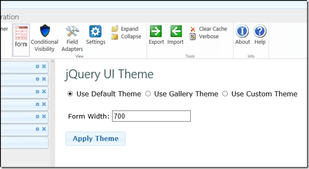
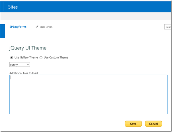
With 2015.01.01 and later, you can configure a different jQuery UI theme for each list. On the settings page, hit the Settings
![]() button. You will see a form that looks like:
button. You will see a form that looks like:
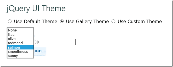
If you click the Use Gallery Theme radio button, you'll have a drop down of 6 themes included in the release:
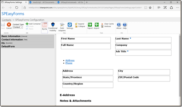
Choose salmon, hit the apply theme button, and go to the form view
![]() and you're interface should look something like this:
and you're interface should look something like this:
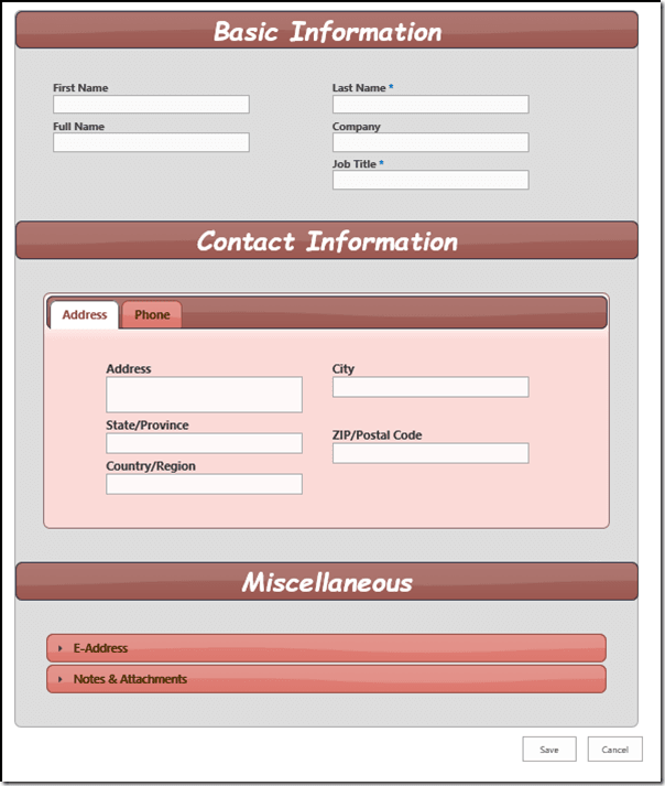
Note that in addition to re-theming the form, you've also re-themed the editor itself. That's because I'm using mostly jQuery UI classes to theme the editor. In order to see the changes in the actual form, you need to hit the Save button. Now if you go to the form (you may need to clear your cache and refresh) you'll see something like:
Now I'm confident that these 6 pre-canned themes are going to meet all of your theming needs right? Ok, I'm actually sure I could have included 60 themes and that still wouldn't be true. And I'm definitely more of a developer than a designer. That's what the third radio button is for:
With this option, you can point me at any jquery-ui.css file and apply it as a theme (assuming you've got all of the other files needed by the theme with it and in the appropriate directory structure). If you put in a path and hit apply theme, and either nothing happens or it goes back to Redmond, it means the browser could not find your theme, i.e. there is something wrong with your path. Go directly to jail; do not pass go. Or, fix your theme and try again. Again, you need to hit the Save button to make the change permanent and see it in the forms.
If you've uploaded your theme to SharePoint, you can use ~sitecollection or ~site to represent the path to the current site collection or site respectively. Before trying to load the style sheet, SPEasyForms will replace these tokens with the appropriate path. This is useful because you can move a configuration between a developer farm and production and it will still work (assuming the theme is in the same place on each farm). But of course, the theme does not have to be stored in SharePoint; you can even load it from a CDN assuming your users will be able to access the CDN when they're using the form.
Finally, you can set the width of the SPEasyForms outer container. The default is 800, but depending on the design and complexity of your form and list, you may have to play around with this until you find something that works. In my form, I've set this to 700. If I set it any smaller I'll start seeing weird glitches like scroll bars in the accordion content, or the content of tabs overrunning the edge of the tab.
2.2 Changing the Default Theme for the Site Collection
You must be a site collection administrator to change the default theme for the site colleciton. To do so, go to the site settings page of the root site for your site collection. Under the Site Collection Administration heading, click the link that says SPEasyForms, and you should see the following page:
This looks very similar to configuring a list in the editor, except there is no option to revert to the default theme, because the default theme is what you're configuring. Just choose one of the six gallery themes. Or choose use custom theme and enter a path to the jquery-ui.css file. Again, you can use ~sitecollection in your path if your theme is stored in the current site collection. So if I choose use custom theme and enter the path '~sitecollection/Style Library/jquery-ui-peppergrinder/jqury-ui.css' for the path, save it and open the settings page for a list that isn't configured to use a non-default theme I see:
and...that...doesn't...look...right at all? This is jQuery with no CSS applied. It still functions, but it doesn't look very good. The reason: if you look at my configuration above I've spelled jQuery wrong in my path. I demonstrate this because I know it's going to happen and showing what it looks like may help (if anybody actually reads this). Anyway, if I fix the path, clear the cache, and refresh the editor I get:
Which is a bit more like what I was expecting.
Also note that there is a large text area called additional files to load. I can specify additional JavaScript and CSS files to be loaded on every page in the site. This was intended to provide an easy way to install SPEasyForms AddOns in the future, without the need to install a hotfix sandbox solution, but it can also be used as a sort of Swiss army knife for designers that want to tweak forms a little more than SPEasyForms will allow. Buyer beware though, before loading files in this way, you must understand:
- These files are loaded on every page in the site, just like the JavaScript files that implement SPEasyForms. That means if they're broken they can break every page in the site.
- You must use ~sitecollection at the beginning of the path for each JavaScript file. That's because behind the scenes I'm going to create a user custom action for each JavaScript file and let SharePoint actually load them up just like it loads up SPEasyForms. But SharePoint only allows script user custom actions that point to script files in the current site collection.
- You may use ~sitecollection in CSS file paths as well, but it is not required, CSS can be loaded from anywhere.
In general, before loading any files like this in a production environment, you should test them in a non-production site collection to ensure that they are stable and provide the functionality desired.
3. Containers
As mentioned previously, the rest of this document is going to follow a scenario, starting with a list and some requirements, and showing how SPEasyForms can be used to satisfy those requirements. This section will describe the list that will be the starting point for our scenario.
I generally start regression testing with a Contacts list, because that's an OOB list type that has enough fields that the form looks pretty bad as is and could use some restructuring. In order to demonstrate all of the current capabilities of SPEasyForms, I'm going to make the following changes to the list:
- Create a site content type called Employee using Contact as the parent content type and add the following new site columns columns:
- EmployeeId - single line of text.
- HireDate - date.
- EmergencyContact - enhanced rich text.
- HomeAddress - enhanced rich text.
- Create a Custom List called SalesRegion
- Change the display name of the title column to SalesRegion
- Create a Custom List called SalesDivision
- Change the display name of the title column to SalesDivision
- Add a lookup column called SalesRegion and configure it to use the SalesRegion list
- Create a Custom List called SalesState
- Change the display name of the title column to SalesState
- Add a lookup column called SalesDivision and configure it to use the SalesDivision list
- Go to or create a Contacts list and turn on allow management of content types in the list settings.
- Create the following list columns in the Contacts list,
choosing 'Add to all content types' when you do (or even better site
columns added to both content types):
- Code - a single select choice field (Blue, Green, and Red for the allowed choices).
- SalesRegion - look up the SalesRegion list where the title field has a display name of SalesRegion.
- SalesDivision- look up to the SalesDivision list where the title field has a display name of SalesDivision.
- SalesState - look up to the SalesState list where the title field has a display name of SalesState.
These last 3 fields are to demonstrate cascading look ups, which we won't get to until section 4. Field Control Adapters. I'll describe the reference lists in more detail when we get to it, so if you're not sure how to set them up you can skip it until then. However, if you've ever setup cascading look ups for SPServices before, it's just like that because I'm using the SPServices library to implement cascading look ups.
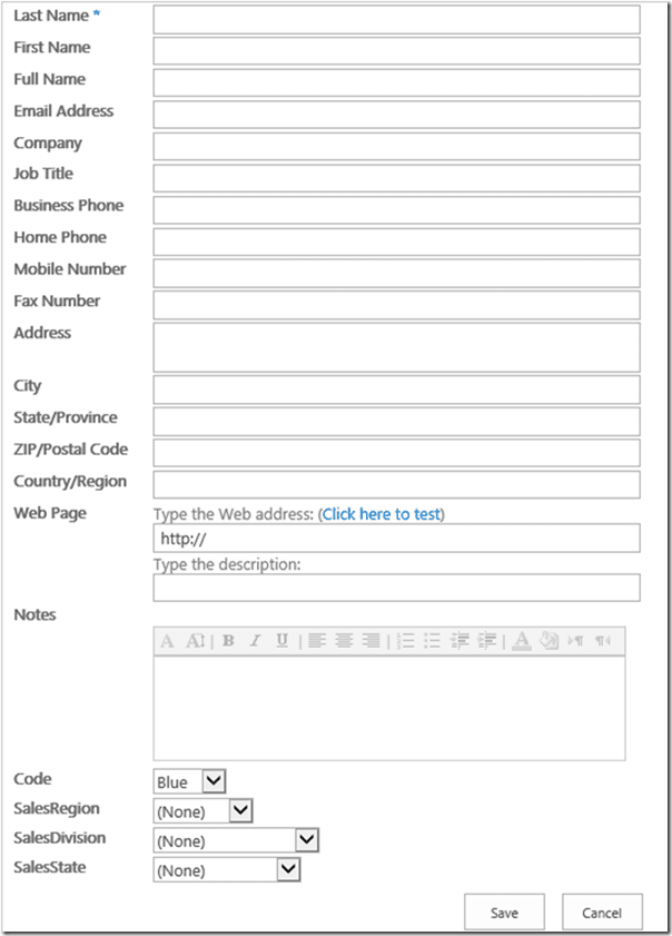
Anyway, now that we have all of this stuff configured, go to the new form for an Employee:
I know what you're thinking...p r e t t y my p r e c i o u s! That brings us to the first requirement for our scenario:
- Make the form pretty.
Now I'll be the first to admit this isn't a very good requirement, but if you've been working in this business for a while you probably recognize it as a pretty common one. So you resist the urge to call the customer stupid and start pitching ideas. Maybe we could organize some of the fields into tabs? You start white boarding and come up with a design that the customer seems to like. Maybe pretty is going a bit far but it's hopefully more visually appealing and functional at least. That's what containers are all about so lets configure one.
3.1 Columns
The columns container just lets you organize fields into two or more side by side columns (technically it can be 1 or more, but 1 column doesn't really gain you much). To add a columns container:
- Click the Add Container button.
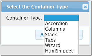
- Select Columns from the drop down list and click Add.
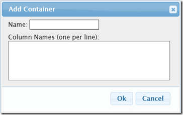
* Note: nothing is actually required for this dialog. If I just hit Ok, it will create an empty columns container named Columns. I used to require you to enter at least one column name in order to create a field collection, because a container without fields didn't make a lot of sense. But now you could create a columns container that had two columns, the first a tabs container and the second an accordion container, and put the fields on those containers. And since those containers have to be created separately and dragged onto the columns container, it might make sense to create an empty container.
- Enter column names one per line and hit OK. In this case I'm just going to enter 1 and 2.
* Note: The names of the columns doesn't matter much because they're not actually displayed on the form for a columns container. If this were a Tabs container, the names would be used to label the tabs, so they would be more significant.
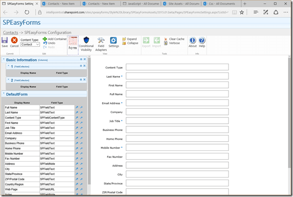
The settings page should now look like this:
The first thing to notice is that nothing really changed on the WYSIWIG side of the form. You might think you just need to scroll down and you'll see columns, but trust me nothing changed. This is because containers that have no fields are hidden. This is a trick that you can use to your advantage when configuring multiple content types for a single list, but I'll save that discussion for the end of this section.
In the properties pane, however, you'll now see 2 containers, the
second one being a columns container with two empty field collections.
Once you have more than one container, you can reorder the containers
via drag and drop. In the picture to the right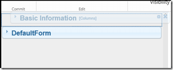 I've dragged the columns container above the default form (after
collapsing all containers, I might have mentioned how to do that
earlier). The blue dashed box below the hovering container is called a
placeholder and indicates where the item would be placed
if you let go of it right now. If the fill color of the placeholder is
red, it is not a legal place to drop the current item. If you drop it
anyway, it is returned to it's original position.
There's still no change to the WYSIWIG, to see it there you have to put some fields in at least one of the two field collections so lets start doing that.
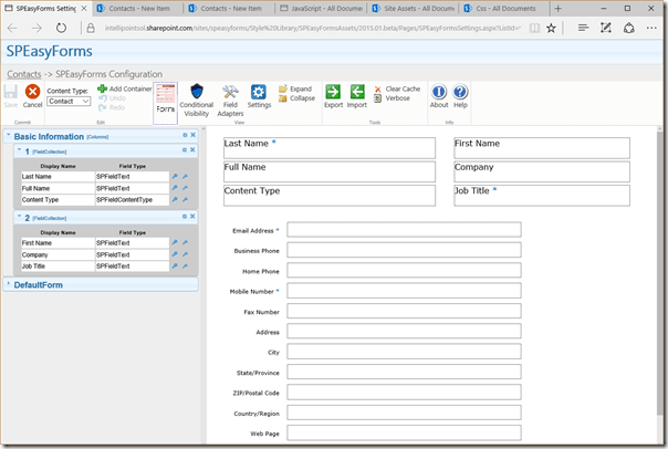
First expand the containers. Now you can drag fields from the default form and drop them on the field collections in the columns container. You can drag fields from any field collection to any other field collection, or even reorder the fields within a field collection via drag and drop. You can only drag fields one at a time, which can be a little tedious but you have to admit it's still easier than coding a custom solution. I may try to implement a multi-select drag and drop in a future version, but for now it's one at a time. I'm going to put a few fields in each column, after which my settings page looks like this:
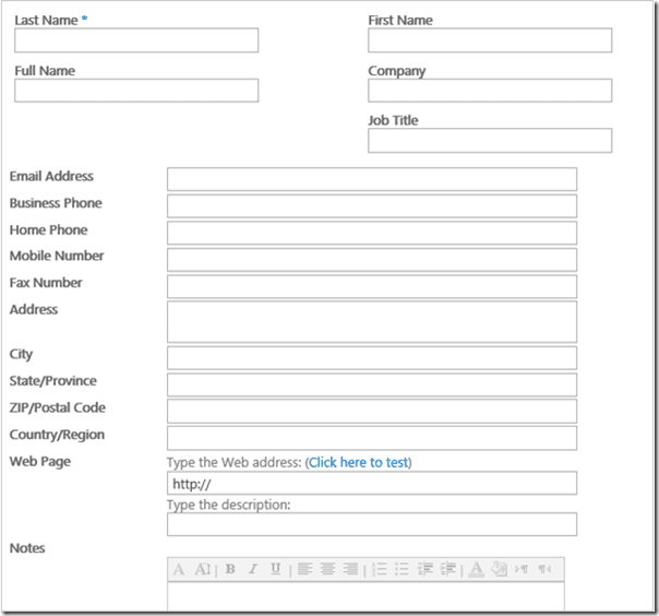
Now there are some changes to the form view. I have 6 fields arranged in 2 columns followed by the default form. Of course the form view isn't really a WYSIWIG, it's just structurally close. It doesn't draw any input controls, the boxes on the right-hand side are just the form body table cells with some CSS to give it a border, which becomes apparent when you see the columns container in the form view, because the field labels move inside the box. In addition to moving the fields into a multi-column table, the columns container moves the field label into the form body cell placed above the input control to save horizontal space (if there is more than one column). It also applies some CSS to shorten ms-longinput controls, when and only when they're on a columns container, again to save on vertical space. To see what it really looks like you need to open up the new form on the list again, but first hit the save button in the editor or you'll be utterly underwhelmed by the dramatic lack of changes to the form. Once you've saved, the new form should look something like this:
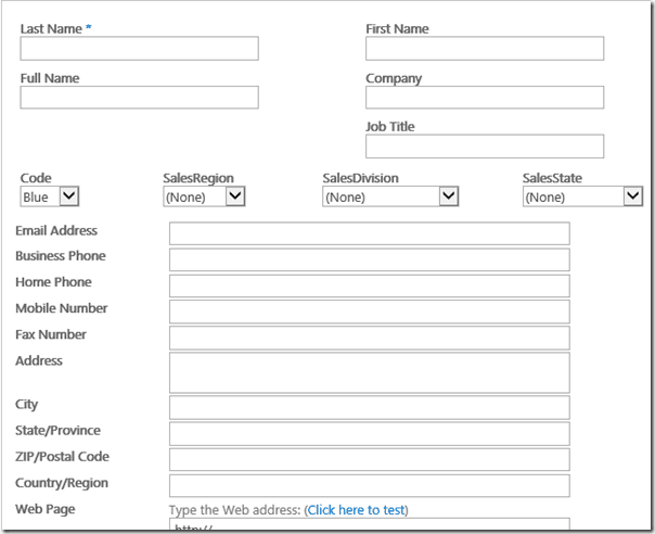
I would be lying at this point if I was to say that we'd achieved anything even close to pretty, but we're making some progress and it took a lot less time to configure it then it took to write this section. But the real power of containers is that you can put as many as you want on a page and mix and match them any way you want. To demonstrate, add another columns container to the form with 4 columns, drag it just below the first columns container, and add the four fields Code, SalesRegion, SalesDivision, and SalesState to it, one per field collection. Save it and refresh the new form and it should look something like:
Again, its not particularly sexy, but it's starting to show some potential. With just the columns container I can create a wide variety of grid layouts, limited only by the horizontal size of the controls and how wide I'm willing to let the form get. And let's face it, everyone knows most user's have a display with more horizontal real estate than vertical and nobody likes to scroll (at least maybe everybody except the guys at Microsoft who wrote the first SharePoint forms ;).
Anyway, the basic idea behind containers is to organize fields in a way that maximizes screen real estate, and the Columns container provides some ability to do just that. But the other containers, tabs and accordion, have even more potential to maximize screen real estate, so lets quickly see how they work.
3.2 Tabs
Tabs are configured in the same way as columns in general, but in this case I'll use them to briefly show nested containers. The tabs I'm going to configure look like this:
| Tab Name | Fields |
|---|---|
| Address |
Address City State/Province ZIP/Postal Code Country |
| Phone |
Business Phone Mobile Number Fax Number HR |
| HR |
Leave the HR tab empty for now. Each of these tabs will be a two column display. Start by adding an empty tabs container, and two 2 column columns containers named Address and Phone. Then drag the address fields onto one of the Address columns and the phone fields onto one of the Phone columns. When you're finished, the editor should look something like this:
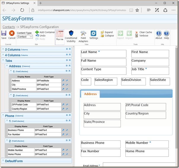
All of the containers are at the top level at this point, nothing is nested (except the field collections of course which are always nested). What I want is for the Address and Phone containers to be tabs on my Tabs container. To achieve that I need to grab the Address container and drag it right until I see the placeholder indent, and then drop (the tabs container needs to be expanded, i.e. icon down, in order to drag stuff onto it):
Now do the same thing to the Phone container, and the editor should something look like:
Note that the tabs are fully functional in the editor, and that the HR tab is not displayed at all in the WYSIWIG. Just like empty containers are hidden, generally empty parts of containers are hidden too.
3.3 Accordion
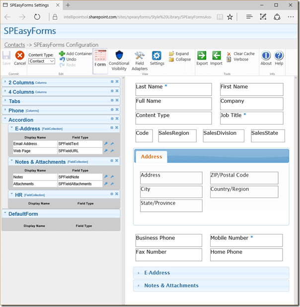
The accordion is more or less just like tabs except that headers are stacked vertically taking up more vertical real estate, and all content areas are collapsed initially taking up less vertical real estate. This makes the accordion more appropriate for optional fields of lesser importance. Configure the accordion as follows with just two nested field collections with two fields each:
| Header Name | Fields |
|---|---|
| Notes & Attachments |
Notes Attachments |
| E-Address |
Email Address Web Page |
| HR |
Again, leave the HR content area empty. Once you've configured the accordion, the editor looks like:
Now beauty is in the eye of the beholder, but I still think pretty is a stretch.
Anyway, I think we've achieved the goal of making a messy form more visually appealing and functional. If you disagree, move some stuff around, add some containers, make it your own.
So it's taken me hours to write this document so far. It's probably taken you 30 minutes or so to read it up to this point, depending on a number of factors like attention span, and weather your trying to follow along with a SharePoint site open in another tab, etc. But once you get familiar with the interface, you could configure a form like this from scratch in 2-3 minutes tops. Being able to satisfy a requirement as vague as 'make the form pretty' in a few minutes is pretty nice.
3.4 The Finished Product...Almost
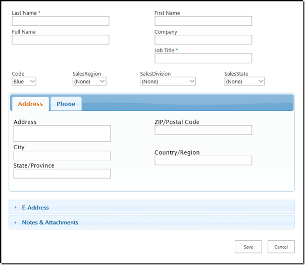
We're pretty much done with the basic structure and layout of the form. Go ahead and go to the new form for your list and it should look like this (assuming you've saved your changes of course):
So what's with this ...Almost crap? OK, I know I'm not fooling anybody, you can all see the next header, I've dropped plenty of hints, and we haven't configured any of the fields specific to the Employee content type. If you go back to the list and open the new Employee form, you'll see the Employee specific fields at the bottom of the form drawn just the way SharePoint would usually draw them. That's because they are on the default form, and in our SPEasyForms configuration we put the default form at the bottom of the page. If you drag the default form to the top of the containers in the editor, save your configuration, and reload the page you'll see these fields are at the top of the form. You may or may not want to leave some fields on the default form. If you don't, read the next section which will tell you how to configure multiple content types.
3.5 Multiple Content Types
If you skipped the overview and you've just been following along without being particularly inquisitive and clicking on stuff I haven't told you about yet, you may have noticed that at no point in following this scenario did you see the Employee specific fields anywhere in the editor. That's because when the editor loads it brings up the default content type. But given your recent experience with opening the new Employee form, you should understand some things about how SPEasyForms deals with multiple content types:
- There is only one configuration per SharePoint list.
- Fields that commonly exist in multiple content types are only configured once, and appear in the same place in the forms of all content types.
- Fields that don't exist in the currently selected content type are not displayed in the editor and skipped when transforming a form without raising any kind of error.
- As previously mentioned, containers or parts of containers that don't have any visible fields for the current content type are hidden.
- Finally, to change the currently selected content type, find the content type drop down on the ribbon and select the one you want.
Once the content type is changed, fields from the previous content type that don't exist in the new content type are removed from the editor. Any fields specific to the new content type are added to the editor. If they've never been configured before, they are added to the default form container. If you don't see them, you might need to expand this container. Once the data has been fetched, it is cached in the browser session so there is no wait switching back and forth between content types, but not in the browsers page cache, so clearing the page cache will have no effect. If you modify the content type in this or another browser after it has been cached, to see your changes in the editor you need to hit the clear cache button in the ribbon, which will reload the page (save any changes first).
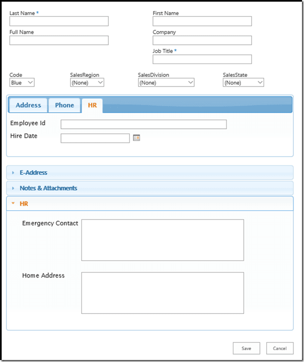
So switch to the Employee content type in the editor now and you should see the Employee specific fields appear in the default form container. If you don't, try expanding the default form container. Now drag a couple of these fields onto the HR tab, and the other two onto the HR content area of the accordion. Save your changes and refresh or reopen the new Employee form, and you should now see the HR tab/content area with the employee specific fields on them. Go back to the new Contact form and you will see the HR tab and content area are still hidden. So your new Employee form should look something like this:
With the following caveats:
- I didn't tell you which fields to place on which HR content area, so yours may not look quite like this.
- I opened the HR tab and expanded the HR content area on the accordion before taking the snapshot in order to fully show what changed. The form loads with the Address tab selected and the accordion fully collapsed to conserve vertical real estate.
You now know everything you need to know about configuring multiple content types in SPEasyForms, we are truly done with modifying the form structure, and thus we are done with containers.
3.6 The HTML Snippet Container
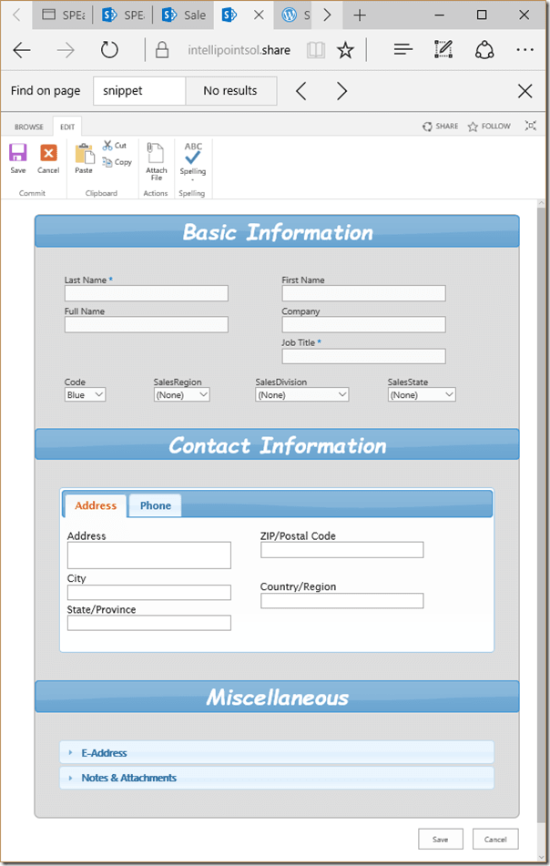
How would you like to be able to make your forms look something like this?
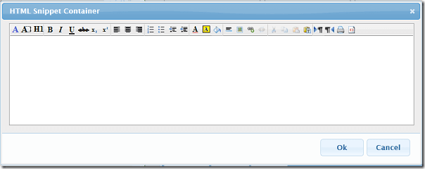
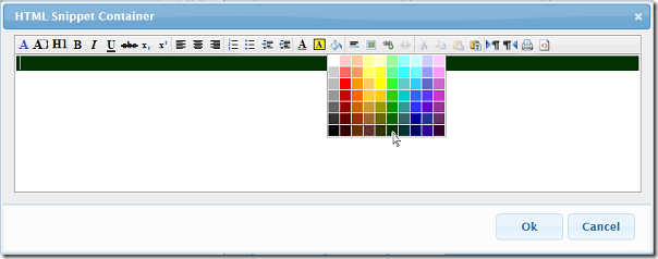
- Click the Add Container button, choose HTMLSnippet as the container type, and hit Add. This brings up the snippet editor, which is a rich text editor:
- Enter a space, hit return, and enter another space. This just gives you two lines (under the hood two divs). Some of the styles like background color apply to the enclosing div, so if you want multiple background colors it helps to create multiple divs before applying background. The reason we entered a space on each line is that many browsers will help you out and remove any empty divs automatically.
- Now move the cursor back to the first line, hit the background color icon
 (all of the buttons have a tooltip explaining what they do, some of
them even have shortcut keys), and select the darkest green:
- Hit the Font Color icon
 and select white.
 - Hit the Font icon
 and select Comic Sans MS.
 - Hit the Font Size icon
 and select 6.
 - Hit the Bold
 ,
Italic
 ,
and Center
  icons.
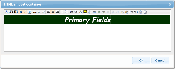
 - Now type in Primary Fields and the editor should look something like:
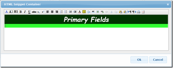
- Now move the cursor to the second line (or div), hit the background icon
 ,
and select a lighter green, which gives you something like:
That's about as fancy as you can get using the rich text editor. You can also add ordered or bulled list, images, hyperlinks, and/or horizontal rules.
<div class="ui-widget-header ui-corner-all">
    <div class="header">Basic Information</div>
</div>
<link rel='stylesheet' type='text/css' href='/sites/speasyforms/Style%20Library/Speasyformsassets/HtmlSnippet.css' />
#spEasyFormsContainersPre {
    border: 1px solid darkgrey;
    -moz-border-radius: 8px;
    -webkit-border-radius: 8px;
    border-radius: 8px;
    background: #eee;
}

.speasyforms-container[data-containertype='Tabs'], .speasyforms-container[data-containertype='Accordion'] {
    margin: 40px auto;
}

.speasyforms-container[data-containername='2 Columns'] {
    margin: 30px auto 0 auto;
}

.speasyforms-container[data-containername='4 Columns'] {
    margin: 0 auto 30px auto;
}

.header {
    font: bold italic 2em "Comic Sans MS";
    text-align: center;
}
- Use whatever HTML editor you like and copy the source code into the snippet container in source mode.
- If you're more graphically inclined and you have decent image editing software, create an image, upload it to a picture library, and link to it in the snippet container rich text editor.
3.7 Stack
The Stack container is new to 2015.01.01, and really wouldn't have been useful in the previous version because there were no nested containers, but with nested containers it can be useful.
At the top level SPEasyForms is naturally a stack. You pile containers one on top of the other and it transforms the form by drawing one container on top of the other. But containers like Tabs and Accordion draw one tab or page per immediate child. So there's no way to put more than one container on a single tab or accordion page. At least, not without the stack container.
To demonstrate, I'll take the form we've been working with, but I've added one new field to the list called Rating of type Numeric. For now it's still on the default form. Now I'll perform the following actions in the editor:
- Delete the HTML Snippet containers. I'm not going to need headers any more because when we're done everything will be on the tabs container.
- Create an empty stack container called Basic Information.
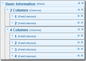
- Drag the 2 Columns and 4 Columns containers onto the Basic Information stack. The stack should now look like this in the properties pane:
Note that the form view doesn't really look any different. There may be a little more padding around the columns containers, but they were already stacked on top of each other.
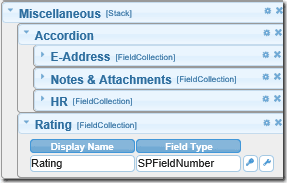
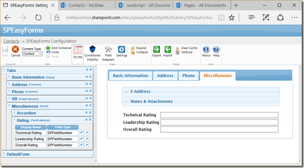
- Now create another stack called Miscellaneous with a single field collection called Rating.
- Drag the Rating field from the default form onto the Rating field collection.
- Drag the Accordion container to the top of this stack. This stack should now look like this in the properties pane:
-
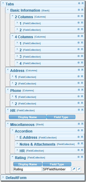
Now drag the Basic Information stack to the top of the tabs container and the Miscellaneous stack to the bottom of the tabs container, and in the properties pane it looks like this:
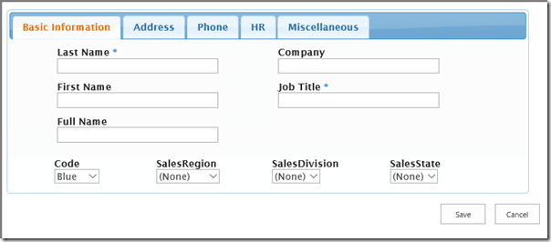
I now have 5 tabs, with the first and last tab each have multiple container stacks on them. If I save my configuration and go to the new form, it looks like:
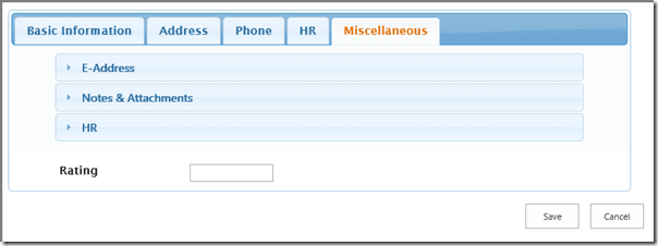
and if I click the Miscellaneous tab it looks like:
This is assuming you've gone to the new Employee form, otherwise the HR tab and page would be missing. And that's really all there is to stacks. They just allow you to logically group other containers so you can move them as an autonomous unit and build arbitrary grids of containers at any level.
As you can see, the properties pane and form can both get pretty complex when you start nesting at multiple levels. For this reason, I've limited the maximum nesting level to 5. If you try to move something to a place that would result in more than 5 levels of nesting, the placeholder turns red. If you drop it anyway, it will return to its original position. There isn't any technical reason I couldn't allow deeper nesting, 5 just seemed like a good practical limit. If you find you need more, I'd be happy to tell you how to modify my code to raise the limit, and maybe even increase it myself in future releases.
3.8 Wizard
The Wizard container is kind of a special case. Unlike Tabs or Accordion, I really only see the Wizard container as useful if most, or even all, of the fields are on it. It allows you to paginate a form so users can step through it.
I've used wizards many times in my career for installers or
troubleshooting guides, etc. But when it came time to write this section
I drew a blank on a good example, so I used a rather whimsical list
with a new form that looks like:
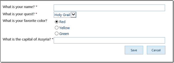
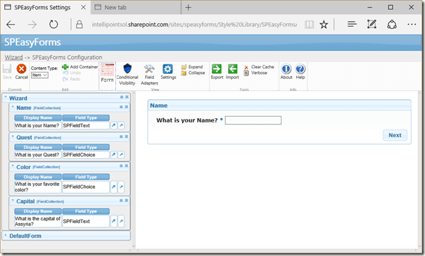
And I'm going to configure the Wizard container to have one page for each question, after which the SPEasyForms settings page looks like:
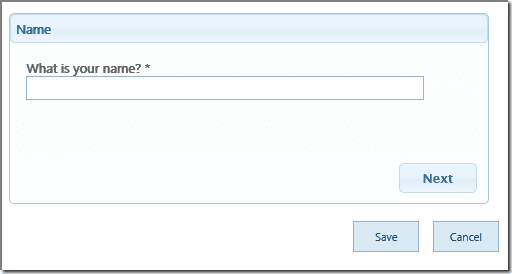
Just like any other container, you can put as many fields or sub-containers on a page as you like. I just didn't have a lot of fields so one per page works. Now when a user opens the new form, they see:
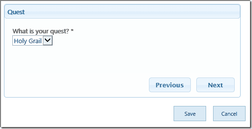
If they hit the next button and they'll see:
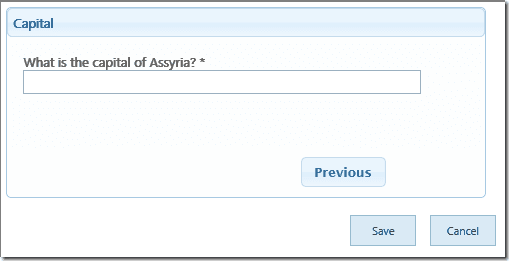
If they keep hitting next until they get to the end they'll see:
For the most part that's it; it's just a basic wizard or survey. Keep in mind that the user can submit at any time, they don't have to get to the end in order to submit. If there are validation errors on a page upon submit, the form will switch to the first page with a validation error displaying the error message.
Also note that the Wizard container only modifies new and edit forms. Having to page through the display form just seems a bit pointless and annoying to me.
One other thing you might want to take advantage of is that just like any other container that hides fields, the Wizard container will skip pages if all of the fields on the page have been hidden using conditional visibility rules or are not present in the current content type. This allows you to create branching logic, so if I add the following visibility rules to my SPEasyForms configuration:
The form appears to change from a four page wizard to a three page wizard, with the last question being either 'What is your favorite color?' or 'What is the capital of Assyria?' depending on how you answered the question 'What is your quest?'. I'm getting a bit ahead of myself talking about visibility rules, but that topic is coming up very soon.
3.9 Validation
So what happens when a required field is on a tab and the user hits submit without providing a value?
- First, any tab that has a validation error is highlighted by giving the tab header a red border.
- Also, the first tab with a validation error is automatically selected.
- The OOB validation messages that are normally displayed with a field are still displayed with the field.
Validation for the Accordion feature works in the same manner.
4. Conditional Visibility
Note: this is NOT a security mechanism. It is appropriate for "business process" visibility requirements. If disclosure of fields to the wrong people would be considered to be any kind of a security breach, no front end solution is appropriate. A clever/technically savvy user can get to fields that are supposed to be hidden from them using the JavaScript debugger or DOM inspector, or in SharePoint 2010 even just viewing source in the browser. Even if I could fix that, and I can't, they could write their own JavaScript, call the web services, and view the raw data.
I get a lot of requirements like "I don't want people in group X to see the phone number field". Or "I only want people in group Y to see the phone number field". Or the address field should be on the edit form but not the new form. Or even I want people to be able to edit the title field if A=B, but it should be read only when A=C, where A is another field in the same form. Conditional visibility in SPEasyForms is intended to satisfy all of these requirements and more.
Here are the step by step instructions to start configuring a field visibility rule for a given field:
- On the properties pane, find the field you want to create a rule for and click on the little key icon button to the right of the field. This brings up the Conditional Visibility Dialog for the field:
- Now click on the + icon button. This brings up the Add/Edit Visibility Rule Dialog.
4.1 Simple Rules
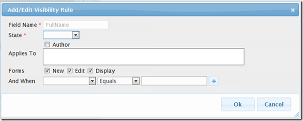
For a new rule, the Add/Edit Visibility Dialog comes up looking like this:
There is a lot of stuff here, most of which we're going to ignore for a moment. The only required field on this dialog is the State, which determines what you want done to the field if this rule is executed. Choose Hidden as the State and click the OK button. The Conditional Visibility Dialog now looks like this:
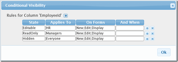
This rules just says hide the field from everyone on all forms with no conditions. As a stand alone rule, this is rarely going to make sense. If you never want it displayed or editable, why did you add the field in the first place? I suppose you could be setting the field through a workflow and using it in a view or something like that. However, once we start looking at multiple rules and precedence, you may find that you are writing rules like this pretty frequently as part of a set of rules for the same field, but we'll get to that in a bit.
Looking back at the Add/Edit Rule Dialog you can see the forms to which the rule applies, and New, Edit, and Display are all checked by default. Click the gear icon next to the rule to edit it, remove the check on the Edit and Display, click OK. Now the rule says hide the field on the new form with no other conditions. This rule is more likely to make sense even as a stand alone rule. It satisfies all of the 'the address field should be on the edit form but not the new form' type requirements, and I've certainly been given real requirements like this before. If you click the OK button on the Visibility Rules Dialog and the Save button on the ribbon, you can go to the new Contact form and the Full Name column is now gone. If you save a Contact and go to the edit form, it's back. That's about it for the simplest of rules.
4.2 Rules Based on SharePoint Group Membership (and Author)
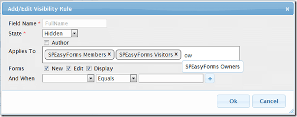
The next class of requirements that I wanted to satisfy is the 'some people should see it, others should not' type of requirements, which is the most common use case for conditional visibility. To accomplish this, you need to put the people in question in SharePoint groups and then create a rule using those groups, like so:
The applies to control is an entity editor, much like SharePoint's people picker, which mostly works but I know still needs some work too. It allows you to start entering a SharePoint group name, provides auto complete on contains case insensitive, and when you select a group it adds an entity. To remove an entity click the X on the entity. Where it falls short is that if you type some text but don't resolve it to an entity, when you click OK it silently throws away your text instead of raising a validation error, even if you typed the full group name. I may or may not fix that before the first release. Either way I know it is a little weak and will fix it eventually. For now I've warned you about it so caveat emptor.
Back on point, the above rule says hide the field for members and visitors with no other conditions. This will show the field to anybody not in those groups, so it satisfies some of this type of requirement. For more complex cases, you need multiple rules, and blah, blah, blah, we'll get to it soon I promise.
The other thing to note is the author check box in the applies to area. This is there to allow you to apply a rule specifically to the original author of the item (i.e. whoever opened the new form and saved it). It's not that uncommon to get requirements like make this field editable by the author but read only for everybody else, and without this check box there would be no way to generally satisfy this requirement. Of course, once again you'd need multiple blah, blah, blah, because a single rule can only have one state.
4.3 Rules Based on the Value of Another Field
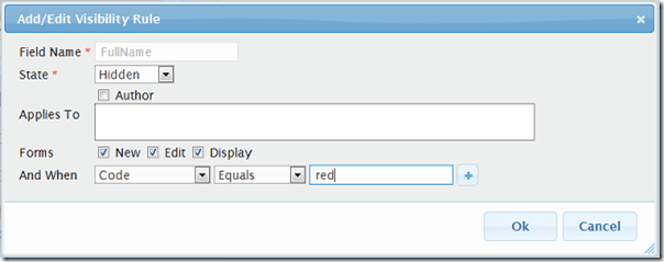
The last class of individual conditional requirements I wanted to satisfy is rules like 'make the field hidden if Code is red, read only if Code is green, and editable if Code is blue. This will obviously require multiple rules and we're still not ready for that, but the basic building block for this type of rule is something like:
Which is make the field hidden when Code equals red. Note that all three of the comparison operators built in are case insensitive. I went back and forth on this a little, but mostly I question the usefulness of having a form where red and Red are both options but mean different things, so I think I settled on the most common use case. In addition to Equals, the built in comparison operators include Matches and NotMatches. If the value is literal, then these are equivalent to Contains or NotContains. But Matches and NotMatches also accept and will evaluate JavaScript style regular expressions. If you're not familiar with regular expressions, start binging because this document is not going to attempt to explain them, but a really verbose/obtuse way to achieve the equivalent of what's above would be
"And When Code Matches ^[Rr][Ee][Dd]$"
(unnecessarily verbose in this case because the comparison is already case insensitive, but if you know anything about regular expressions you get the idea). It's also important to understand what you are comparing too. You're comparison is against the text that is displayed when the field is read only (or more accurately, the HTML). It is not against the internal representation of the data as it is stored in SharePoint. So don't try matching a user with something like "2;#Joe McShea", that's not going to work. What's displayed for a user is a link to the userdisp.aspx page with the text of the display name, so that is what you're comparing against. If you are not sure what to look for, make the field read only for everyone, open the edit form for an item that has a value in the field, and look at the source in the DOM inspector or debugger of your browser.
One of the cool things about rules based on the value of another field is that they will be executed immediately as the value of the other field changes on the form. So save the above rule, open the new Contact form, and change the Code to Red and the Full Name field should disappear. Change it back to Green and it reappears. But in the interest of full disclosure I should note that I started off this paragraph with a half truth. This only works for some types of 'other fields' right now. I've tested it on check boxes, radio buttons, drop downs, multi-select choices, and even single and multi-line text fields and it works. But I also know it doesn't work on rich text, enhanced rich text, and date fields, and I haven't even bothered to test some field types. I suspect where it doesn't work it is because Microsoft has their own change listeners on the controls and they are swallowing the event, or something like that, but I haven't looked too hard to prove that at this point. What it comes down to is, I satisfied most of the requirements for this type of functionality that I've encountered in the real world just making this work with choice fields, so I've moved on for now.
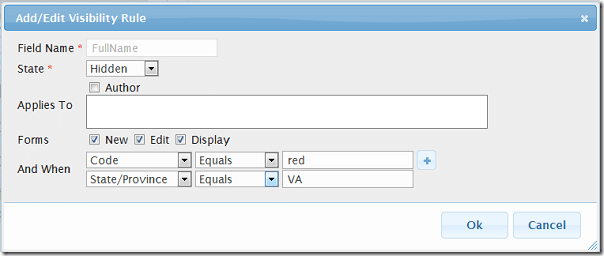
The final thing of interest for this type of rule as a stand alone rule is that you can have more than one condition in a rule. Up to 3 right now just to simplify the UI, but the back end supports an unlimited number and I may make the UI more flexible later on. You add conditions by clicking the + icon button, and multiple conditions in a rule are ANDed together, so:
says when Code Equals red AND State/Province matches VA. You can do OR as well, but only with multiple rules, and blah, blah, blah, if I'm sick of saying it I imagine you're sick of hearing it.
4.4 Rules that Combine the Concepts Described Previously
So there are basically three fundamental types of conditions as described in the three previous sections, Applies To, Forms, and And When. You can specify any combination of these conditions in a single rule. When more than one of these types of conditions is specified, they are ANDed together. And I've already said it in the previous sections, but it bears repeating succinctly and in one place to avoid confusion; each of these types of conditions can contain multiple comparisons, and when they do, weather it is an AND or OR is handled differently for each, so to reiterate:
- Applies To: specify Author and one or more groups, or multiple groups, and it is an OR comparison, i.e. 'member OR visitor'.
- Forms: specify more than than one form and it is an OR comparison, and if this isn't intuitive to you, how in the heck do you imagine somebody could be on the New AND Edit forms at the same time?
- And When: specify more than one condition and it's an AND comparison, i.e. 'Code Equals red AND State/Province Equals VA'. You can achieve OR with these conditions only through multiple rules, which thank heaven we're finally ready to talk about.
4.5 Multiple Rules for a Field and Precedence
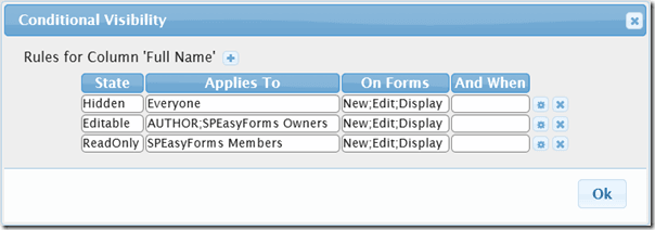
Consider the following rules for the Full Name field:
Rules are evaluated as follows:
- Rules are evaluated in the same order in which the appear in the UI.
- If a rule is evaluated to be true, it's state handler is executed.
- Once a state handler has been executed, all rule processing for the current field is terminated until another event occurs which starts the rule evaluation processing at the beginning.
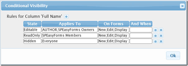
So when the above rules are evaluated, the first rule, which applies to everyone with no other conditions is always true, the field is always hidden, and the other rules are never evaluated. To get the intended results, you need to reorder these rules like so (which you can do via drag and drop):
That's better, but understand that these rules must be in this order exactly to be interpreted consistently. You may think that you can reverse the first two rules and the results are the same, but these rules are not mutually exclusive. Somebody can be both the author and a member, or a member and a owner, and if you reversed the order of the first two fields these users would always see the field as read only, which is clearly not the desired result but given the precedence of operations it is what you told SPEasyForms you wanted.
The other thing to note with this set of rules is the state of Editable. This really just means don't do anything to the field (so for instance on the view form it will still be read only). Why would we need such a rule? I can easily accomplish nothing without any rules whatsoever; heck, without any code whatsoever too. In this case it is so I don't fall through to the 'hide the field from everyone' rule. This is the reason why 'hide the field from everyone' may make sense as part of a set of rules even though it usually does not make sense as a stand alone rule. It's kind of like firewall rules if you are familiar with the concept. You need to put specific rules before general rules, so in order to satisfy requirements like 'owners can edit, but for everyone else it should be hidden,' you need some way to specify a rule that permits owners to edit, even though allowing edit is the default if there are no rules whatsoever.
4.6 Putting it all Together (and back to the scenario)
For our scenario, we have the following requirements for the given fields:
- Company, Content Type, Full Name, and
Job Title
- should be hidden when Code equals red.
- should be read only when Code equals green.
- should be editable when Code equals blue.
- should be editable by Manager at all times.
- All fields on the HR tab or content area (i.e. EmployeeId, HireDate, EmergencyContact, and HomeAddress)
- should be editable for people in the HR group.
- should be read only for people in the Manager group.
- should be hidden from everyone else.
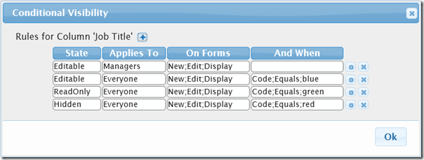
Lets take the first set of requirements and start with the Job Title field. First off, given what we now know about precedence of operations, these requirements are not in the order in which they should be implemented, but customers do not really care about such technical details. The configuration for Job Title should look something like:
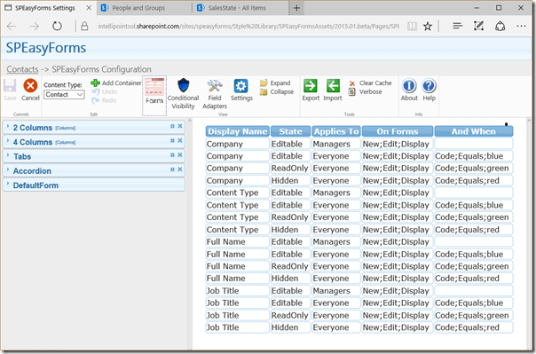
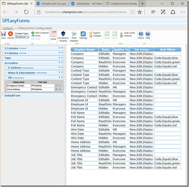
In this case something like is accurate, because since the last three rules are mutually exclusive it does not matter what order they are in, the code will never be both red and green. If code were a multiple choice select field it would be a different story. But the manager rule has to be at the top, or one of the other three rules will always get executed before it is reached. Note also, that the rule that says 'make Job Title Editable if Code equals blue' is completely unnecessary. If removed, when Code is blue and the current user is not a manager, it will drop through all rules without executing any of them, and the result is the same. I think it is a little cleaner with the unneeded rule, but you can decide for yourself. If you configure the above rules for all four of the fields named above, the Conditional Visibility View will look like:
This view is the only place where you can go and see all of the visibility rules for the form (for a given content type, rules that are for fields that do not exist in the current content type are hidden). The rules are sorted by column display name. There are no buttons, and you cannot drag and drop these rules from here, but you can double click on a rule to bring up the Conditional Visibility Dialog for the given field.
Once you have saved these rules you can check out how they affect the form, but before you do, make sure you know if you are in the Manager group or not, or you may once again be utterly unimpressed with the lack of anything new happening in the form (I've made this mistake before a few times, generally ending in a humbling debugging exercise). By the way, if you add or remove yourself from the Manager group, you should just have to refresh the form to see the difference. The current user's group membership is not cached in any way across page loads, so the effects should be immediate.
Lets move on to the second set of requirements, starting with the field EmployeeId. The configuration for this field should look like:
Note that I didn't say something like this time, the order of these rules is entirely significant. The last rule obviously must be last because it always executes. But you also cannot reverse the order of the first two rules, because if you did then somebody in both the Manager and HR groups would see the field read only while somebody in just the HR group would see it editable, which I doubt is what you want. Go ahead and configure the other three fields like this and the Configuration Visibility View should now look like this:
Save the configuration, go to the new Employee form, and check out the results. You should now know pretty much everything you need to know about conditional visibility rules. Try adding some of your own. Refresh the form and check out the result.
4.7 Validation
Note that if you use conditional visibility to hide a field or make it read only, and the field has validation errors, the user will be unable to submit the form. The OOB validation message is hidden, because the entire cell is hidden. If the field is on a tab or accordion content area, the header will be highlighted in red and the first one with validation errors will be automatically selected, but again the OOB validation message is hidden. Even if the validation message was displayed, the user would not be able to fix the problem because there are no input controls in which the required field can be entered. So as a general rule of thumb:
- Do not hide required fields or fields with validation from users who have contribute access to your list.
- If you must hide a field that potentially could have validation errors, make sure that it always has a default value that will pass validation.
5. Field Control Adapters
Field Control Adapters are basically intended to be a replacement for custom fields in SharePoint, or at least to provide custom field like behavior in SharePoint forms using only OOB field types. There are numerous shortcomings of custom field types. For starters they are a farm solution, which is tantamount to being downright evil by modern Microsoft doctrine. But they also suffer some reduced functionality, for instance they cannot be edited in datasheet view. This has always struck me as an unnecessary limitation; why not let people edit it just like an SPFieldText if it is based on SPFieldText, but Microsoft chose to punt and it is what it is.
This is also the area where I see SPEasyForms expanding the most in future releases. The possibilities are nearly endless. Have you ever gotten requirements like:
- I want this field to be an integer, but the control should be a thermometer with a slider.
- I want this field to be a voting/star system where the user casts their vote by moving a dogs tail up or down.
These may be obscure cases, but if you can imagine it, you can probably find someone out there who will say 'yeah, give me one of those.'
But for now I've tried to implement just a small number of these that I consider to be low hanging fruit, meaning I've been asked for these often or I've seen people asking how to implement these in a SharePoint list often. The adapters I've implemented so far are:
- Autocomplete - the ability to provide type ahead functionality for a text field based on the values in a field on a different list in the SharePoint site.
- Cascading Look Ups - the ability to trim the options available in one look up field based on the value selected in another look up field.
- Lookup Detail - populate a field with the value of a field in a lookup list, base on the value selected in another lookup field.
- Default to Current User - pre-populate a user field with the current user.
Before I get into the details of any of them, I want to document the steps for getting to a control adapter dialog for a given field right now so I don't have to repeat it in the implementation specific sections below:
- Hit the wrench icon button next to a field in the properties pane. Note that if this icon does not appear next to a particular field, it is because there are no adapters currently available for that field type.
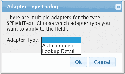
- If there are multiple adapters available for a given field type, you will be prompted to choose which implementation you want applied to this field:
- Once you choose the implementation, an implementation specific adapter dialog will be opened to let you configure the adapter. Note that if there is only one implementation for the given field type, the dialog above is skipped and you jump right to the implementation specific adapter dialog.
One thing of note is that if there are multiple adapter implementations available for a given field type, you will only ever be able to configure a specific field to use one adapter or the other. To change the adapter for a given field, you must first remove the adapter and then add one again choosing a different implementation. You can delete an adapter by clicking the X button next to it in the Field Adapters View. The reason you will only ever be able to put one adapter on a specific field is that adapters manipulate the DOM of the OOB controls for a field, and would almost certainly step on each other. Not buying it? Try to imagine merging the functionality of the dog's tail voter and the thermometer slider described at the beginning of this section in any kind of generic and meaningful way. Think about it?
5.1 Autocomplete
In order for Autocomplete to be configured, all you need to know is the name of another list in the same site and the display name of the field in that list that you want used for type ahead functionality. For our scenario, my requirement is going to be:
- The Job Title field should have type ahead functionality based on the values of the title field in the JobTitles list.
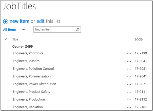
I've already created the JobTitles list and populated it, and it looks like this:
So when I click on the shuffle icon button next to Job Title I am presented with the following dialog:
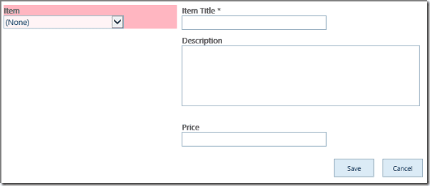
Of course yours is not all filled in yet like mine is, I just didn't want to do before and after screen shots. The only configuration is that you need to select the title of the lookup list and the title of the lookup column. The screen may freeze for a few seconds when you first launch this dialog or when you choose a lookup list. The first case is because I need to get a list of list titles for the site from a web service, and the second is because I need to get list meta data from a web service. In both cases I cache the result so subsequent usage of the same data in the same browser session will be faster.
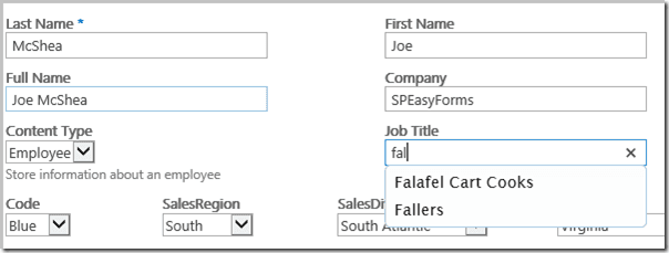
Anyway, once I've configured this and saved my configuration, I can go back to the form and I should have Autocomplete functionality on the Job Title field:
And that's all you need to know about Autocomplete'sort of. You didn't think there wouldn't be another caveat, did you? If you look back at the screen shot of the JobTitles list, you can see that there is a count in the view, and the view currently has 2499 items in it. If the view has more than the list view threshold for SharePoint (usually 5000 items) you may run into some pretty insurmountable performance issues, especially in Internet Explorer. In fact, sometimes the browser hangs with 4000 items. It may be worse if you are bandwidth or latency challenged or your SharePoint farm is not very speedy.
This is in part because of the current implementation of the Autocomplete adapter, which fetches the entire list into a big array on form load (well, just the one field, but still it can be a non-trivial amount of data). I could theoretically make some performance gains by not fetching the list until the user typed a few characters and trimming the results on the server side by sending a CAML query. On the other hand, that would mean more web service calls if the user changed the first few characters, which could perform even worse. I may look at a solution for larger lists in the future, but for now I think I've satisfied the low hanging fruit of Autocomplete.
If you want to remove an Autocomplete adapter from a field, open the dialog, blank out the lookup list control, and hit Ok.
5.2 Cascading Look Ups
Do a search on Bing for 'sharepoint cascading lookup' or 'sharepoint cascading dropdown' and you'll see a lot of questions and even a lot of solutions. I chose not to write my own since there is a perfectly good implementation in SPServices, which I'm already using for calling all of the SharePoint web services, so if you have ever used cascading lookups using SPServices you already know how to setup the lookup lists. If not, I'll show you in a moment, but first lets talk about the requirements for our scenario:
- The options in the SalesDivision drop down should be trimmed based on the value selected in the SalesRegion drop down.
- The options in the SalesState drop down should be trimmed based on the value selected in the SalesDivision drop down.
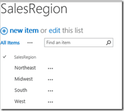
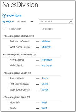
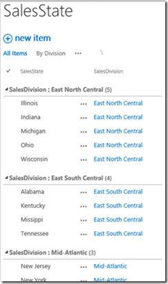
Pretty standard stuff in terms of cascading lookup requirements. The lookup lists look like:
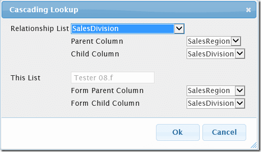
The concept of cascading lookups depends heavily on a relationship list, which describes the relationship between a parent column and a child column. In the case of the first requirement above:
-
The parent column is SalesRegion and the child column is SalesDivision.
-
SalesDivision is also the name of the relationship list.
There is a parent field and a child field in both the relationship list and the current form, and that is what you need to pair up to configure cascading drop downs. The relationship list is a lookup list for the child column in the current form. It also has a lookup to the list that the parent column in the current form looks up against. When I say the current form, I'm talking about the form you are currently configuring in SPEasyForms.
Note that in my case I have also modified the fields in my lookup list so the display names of the parent column and child column match the display names of the lookup fields in the current list. This is not strictly speaking necessary, but it does make the configuration of cascading drop downs much easier as I'll demonstrate in a moment. I've also grouped the views above by the parent lookup field, which isn't necessary at all to make this work, but doesn't it look nice?
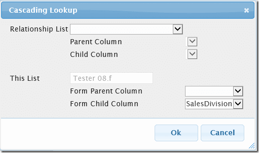
To configure cascading drop downs, click the shuffle icon button next to the child lookup field (the one that will be trimmed) in the properties pane (for requirement 1 that's the SalesDivision field). That brings up the Cascading Lookup Dialog:
It may take a couple of seconds to launch if I haven't already cached the list of list titles. The only things filled out on load are the name of this list and the name of the child column. In order to configure the rest, I first need to select the name of the relationship list, which in this case is SalesDivision, after which the dialog looks like this:
And voila, we're done. I was able to guess the rest of the configuration because there is only one lookup in the relationship list and the display names in the relationship list match the display names in the child form. If that were not true, I would have had to manually marry up the relationship list fields with the current form fields. So follow the same steps to configure the SalesState cascading look up, and the form fields now look like:
Note that there are no options to select for SalesDivision or SalesState. Select a SalesRegion, and SalesDivision gets appropriate options:
And if you configured SalesState correctly, select a SalesDivision and SalesState should have appropriate options.
If you want to remove a Cascading Look Up adapter from a field, open the dialog, blank out the relationship list control, and hit Ok.
And that is all you need to know about cascading look ups. No really, no caveat.
5.3 Lookup Detail Adapter
The lookup detail adapter was originally delivered as an AddOn to 2014.01, and provides the following functionality:
- You can tie a field to another lookup field in the list and another column in the lookup list.
- When the lookup field's value changes, the corresponding data from the other column in the lookup list is copied into the field with the adapter.
- Currently, this adapter can be applied to fields of type SPFieldText, SPFieldNote, SPFieldMultiLine, SPFieldChoice, SPFieldMultiChoice, SPFieldDateTime, SPFieldBoolean, SPFieldURL, SPFieldUser, SPFieldUserMulti, SPFieldNumber and SPFieldCurrency.
Note that since the data from the lookup list is duplicated in the current list, this adapter is only appropriate for situations where what you want is a snapshot of what the data was at the time when the form is filled out. The data is not updated when the data in the lookup list changes; it is only updated when the selected value of the lookup field in the list item changes.
An example of how this might be used is a poor man's shopping cart. Say you had a list of inventory items that looks like:
And you have a list named Cart whose new form looks like:
I've already done some SPEasyForms configuration on this list. I've created a simple master/detail type form, with a lookup on the left (highlighted in red) and 3 detail fields on the right. What I want is to have the 3 fields on the right get populated from the lookup list when an item is selected on the left, and I also want these 3 fields to be read only. The Select an Item field is a lookup to the Inventory list, and the goal is that the Item, Description, and Price fields will be mapped to the Item, Description, and Price fields in the Inventory list using the Lookup Detail Adapter.
The types of these fields are the same in both lists; Single-Line Text, Multi-Line Text, and Currency. This is not strictly required in any way, but for best results the source and destination fields should be the same type. This means not only the same SPFieldType, but also that the fields should be configured the same, in other words the Description field is configured for enhanced rich text in both lists and the Price field is configured for US currency format in each list. If your fields are not the same type and/or are not configured the same in both lists, your mileage may vary. And I will be unsympathetic to issues raised, because type mismatches are allowed but not supported, or at least not guaranteed to work the way you might expect. There are just too many combinations to try to address, for instance what is the expected result of mapping a currency field to a user field? I'd expect it not to work very well, which it won't, so it's working as designed and just don't do that please.
So my initial SPEasyForms configuration looks like this:
With the following visibility rule:
Now we're ready to configure our Lookup Detail Adapters, so follow these steps to configure the Item field as a lookup detail:
- Click the configure field control adapter button next to the Item field:
- Select Lookup Detail from the list of available adapters:
- Select Inventory as the relationship list, Item as the detail column (the column in the lookup list), and Select an Item: as the form lookup column (the lookup field whose change event will trigger refreshing the form detail column):
- Hit the Ok button.
- If you saved now, you would be able to see your work in action, but we may as well setup the Description and Price fields. They are setup exactly the same except the detail column is mapped to the Description and Price fields in the lookup list respectively.
- Now we're done and the adapters should look like:
Now if you go to the new form and select 'Secrets of the Javascript Ninja' on the left, it will fill in the inputs to the right like so:
But we're still missing something, the fields on the right were supposed to be read only. I was originally going to put a checkbox on the adapter dialog for if you wanted the field read only, and make it read only in the adapter transformation. But that turned out to be kind of buggy and conflicted with the conditional visibility rules, which execute at an earlier stage of the transformation, so I ripped that out. As a result, if you want it read only, you'll need to configure conditional visibility rules separately, like so:
Now if you go to the new form and select 'Secrets of the Javascript Ninja' on the left, it will fill in the inputs to the right and they'll be read only like so:
Note that since the Item field is redundant, I've hidden it completely. The reason for the redundant field is because I want them to be able to pick a title from a drop down, but the title field in a SharePoint list item doesn't work that way (although I could create another adapter that makes it work that way).
5.4 Default to Current User Adapter
The default to current use adapter is as simple as an adapter can be, so I'm not going to write much about it. It can only be applied to user fields (either single or multiple user fields). When you click the icon to add an adapter, you get this dialog prompt:
Simply hit the Add button and you're done. When the new form is opened, if the user field is empty, it will be pre-populated with the current user. It does nothing on the edit or display forms.
5.5 Star Rating Adapter
The Star Rating adapter can be applied to fields of field type Numeric, and provides an interface for the field that is a graphic of 5 grey or gold stars. In the new or edit form, users can choose the rating by clicking on the appropriate star. It is as simple to configure as the default to current user adapter, just click the wrench icon next to a numeric field and you get this dialog prompt:
Simply click the Add button and we're done. To demonstrate, I'm going to go back to the form we've been configuring for our scenario where if you'll recall I've already added a Numeric field called Rating. I'm going to rename this field Technical Rating and add two more Numeric fields called Leadership Rating and Overall Rating. And I'm going to drag all three fields to the Rating field collection on the Miscellaneous tab, after which my editor should look like:
If I save this and go to the new or edit form, the Miscellaneous tab now looks like:
And I can click on the stars to change my rating. I can even click a little to the left of the first star to change the rating to 0 stars (there's nothing I hate worse than a review that says I would have given 0 stars if I could have).
5.6 The Field Adapters View
Just as there is a view for seeing all visibility rules, there is also a Field Adapters View in the editor for seeing all configured adapters by field display name (for the current content type). After configuring the adapters described in the previous sections, this view should look like this:
The last column in this table shows adapter specific configuration in the raw, because the editor does not know anything about this configuration information other than that it is in the configuration. You can delete an adapter by clicking the X button to the right of it and edit an adapter by double clicking anywhere on it's row.
Note that the foreign lists are stored by GUID and Title. The GUID is used to find the list, but if there is no list with the given id the Title is used instead. This means the configuration should fix itself on import as long as there is a list with the same Title in the site you are importing to, and it has the same fields.
5.7 Validation
None of the adapters included in this release release has any validation issues, since they do not hide the field/controls, they just augment the functionality of the field. It is certainly quite possible that a field adapter could hide validation errors from the user, making it difficult or impossible for the user to submit the form, but validation works the same on Autocomplete fields and Cascading Look Up fields as it does on OOB text fields and look up fields.
6. Wrapping It Up
Well, that's it. I think I've now described all of the functionality that will be included in the 2015.01.01 release. Hopefully somebody else finds it useful.
The nice thing about the requirements in the scenario used in this document is that they all mapped nicely to what SPEasyForms already does. You're mileage may vary. But if you do have requirements that cannot be met by SPEasyForms, let me know. I'm always looking for ideas for the next version.
Appendix A. Initializing Field Values with Request Parameters
You can initialize values in forms for most SPFieldTypes by passing request parameters in the URL, but because of the number of different SPFieldTypes, using it is not entirely intuitive. In general:
- Parameter names should start with spef_. This tells SPEasyForms that this parameter is intended to initialize a field value.
- The rest of the parameter name should match the internal name of the field you want initialized.
- The parameter value should be URL escaped using the JavaScript function escapeURIComponent(a), or something equivalent if you're not constructing the URL in JavaScript. If this isn't done and the value contains special characters like ampersands and newlines, you're may see some undesirable side effects.
So, if you go to a form with a URL like:
<formURL>?spef_Title=My New Title& spef_Description=My New Description
SPEasyForms will look for a field with the internal name of Title and set it to 'My New Title' and a field with the internal name of Description and set it to the value 'My New Description'. So you can pretty much stop reading now, right? It's pretty self explanatory? But how do you set a people picker field? or a boolean? or a date/time? A lot of decisions had to be made during the coding about how to set different field types. You could guess about how those decisions were made, or you could read the table below:
|
SPFieldType |
Example |
Description |
|
SPFieldText SPFieldNumber SPFieldCurrency |
spef_Title= text |
Nothing special here, this is the simple case. |
| SPFieldNote SPFieldMultiLine | spef_Description= text |
Newlines will have to be escaped, and this only works on fields designated as plain text. Enhanced Rich Text does not work and Rich Text wasn't actually tested. |
| SPFieldChoice (Dropdown) | spef_Choice=A | A should equal the text of an option in the drop down. If not, A will be inserted into the fill-in input box if there is one. |
| SPFieldChoice
(Radio) |
spef_Choice=A | A should equal the text of label for a radio button. If not, A will be inserted into the fill-in input box if there is one. |
| SPFieldChoice (Checkboxes) | spef_Choice=A;B;C | A, B, and C should each equal the text in a label for one of the checkboxes. If not, they will be appended to the fill-in input box if there is one, with multiple values separated by a semi-colon. |
| SPFieldDate | spef_DateAndTime= 1/2/2015 4:25 PM |
The date passed in must be able to be parsed by the JavaScript Date object. This can unfortunately be somewhat browser specific, for instance I originally left out the space before PM in the example, which worked fine in IE but not in FireFox. The time may be omitted and will be ignored if the field is date only. |
| SPFieldBoolean | spef_YesNo=NO | You can pass in either 0, no, or false (case insensitive) to uncheck the box. Any other value will check the box. |
| SPFieldURl | spef_HyperLink= http://speasyforms.com| SPEasyForms |
Pass in just a URL and it will be used for the URL and the description. To pass a separate description, pass the URL, followed by a pipe, followed by the description. |
| SPFieldUser | spef_User= joe@speasyforms.com |
Pass in any value that the people picker can resolve (user name, email, SIP address, even display name if it is unique). If the field accepts groups, you can pass in anything that can be uniquely resolved to a group |
| SPFieldUserMulti | spef_Users= joe@speasyforms.com; SPEasyForms Visitors |
Same as above except multiple values are separated by a semi-colon. |
| SPFieldLookup | spef_Lookup=3 | Generally, you should always pass in the ID for a lookup. You can pass the text instead, but if it is not unique the first match as it appear in the dropdown will be selected. |
| SPFieldLookupMulti | spef_LookupMulti=3;7 | Same as above except multiple values are separated by a semi-colon. |
Note that if SPEasyForms is installed and activated on a site collection, you can initialize fields using request parameters in any list even if the list is not configured to use SPEasyForms.
Appendix B. Variables in Conditional Expressions
One of the weaknesses in the original implementation of conditional expressions in visibility rules was that you could only compare a field with a literal expression. I was asked by someone how you could write an expression to see if a user field contained the current user, and at the time the answer was you can't. But this would obviously be pretty useful, so I went ahead and added it. You can now create a conditional expression like:
Where 'Manager' Matches '[CurrentUser]'
and if Manager is a people picker field, the visibility rules engine will substitute a pattern for [CurrentUser] that will make the expression work. While I was at it, I added several other variable expressions that I thought would be handy. The table below shows the complete list of variable expressions you can use:
|
Expression |
Interpretation |
| [CurrentUser] | Gets replaced with a regular expression suitable for matching against a people picker field. The actual expression 'userdisp.aspx\\?ID=' + currentUserId + '[$&]', which matches the link to a user in a people picker. |
| [CurrentUserId] | Gets replaced with the site collection integer id of the current user. |
| [CurrentUserLogin] | Gets replaced with the current user's login name. The format of the name may vary depending on the authentication method and SharePoint version. For instance this may be a domain name, or it may be a claims based name. Whatever appears in the user name field on userdisp.aspx is what will be used here. |
| [CurrentUserEmail] | Gets replaced with the work email address of the current user. |
| [Today] | Gets replaced with todays date. |
| [Today+2] | Gets replaced with todays date plus 2 days. You can add or subtract any number of days by added [+-]X, where X is an integer. |
| [Now] | Gets replaced with the current date/time. |
| [Now-60] | Gets replaced with the current date/time minus 60 minutes. You can add or subtract any number of minutes by added [+-]X, where X is an integer. |
Its not an exhaustive list; these are just the variable expressions I thought would be useful on the spur of the moment. If there are other variable expressions you think would be useful, let me know on the CodePlex discussion board and I'll consider adding them.

